Enabling teams to digitise 2,500+ government services
Role
Design system strategy, Creation and management, User Interface, User Experience
Collaborators
Collaborated with Design Directors, Product Owners, Developers and Design Teams
Tools
Sketch App, InVision, Zeplin
As the Senior UI/UX Designer for TAMM, I worked with multiple cross-functional product teams to create and shape elegant user experiences that made it easier to quantify business impact. This section will describe my experience and the strategy I developed and implemented for TAMM's design system and other services.
*Because of the project's confidential nature, a few images have been obscured.
Background
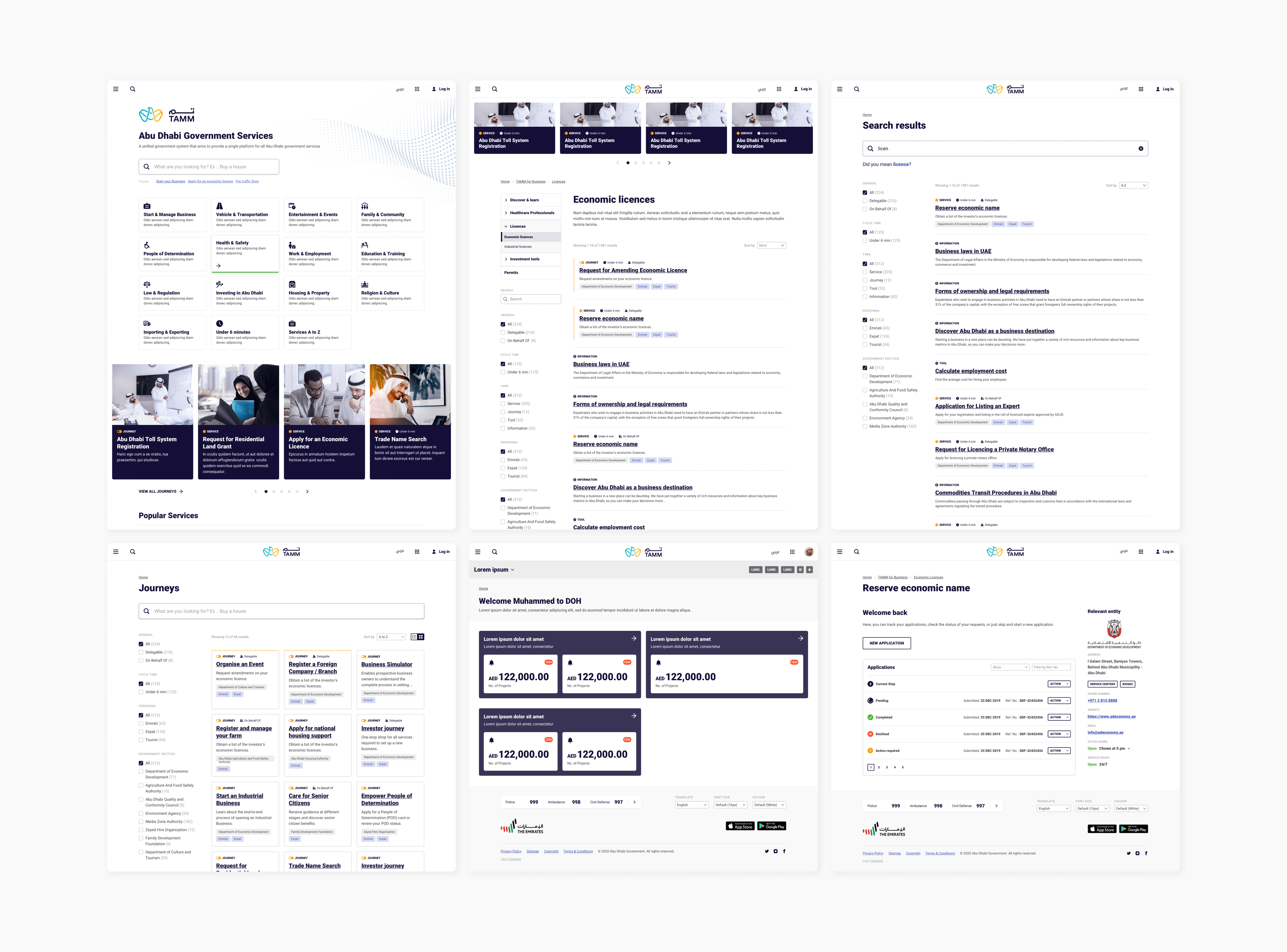
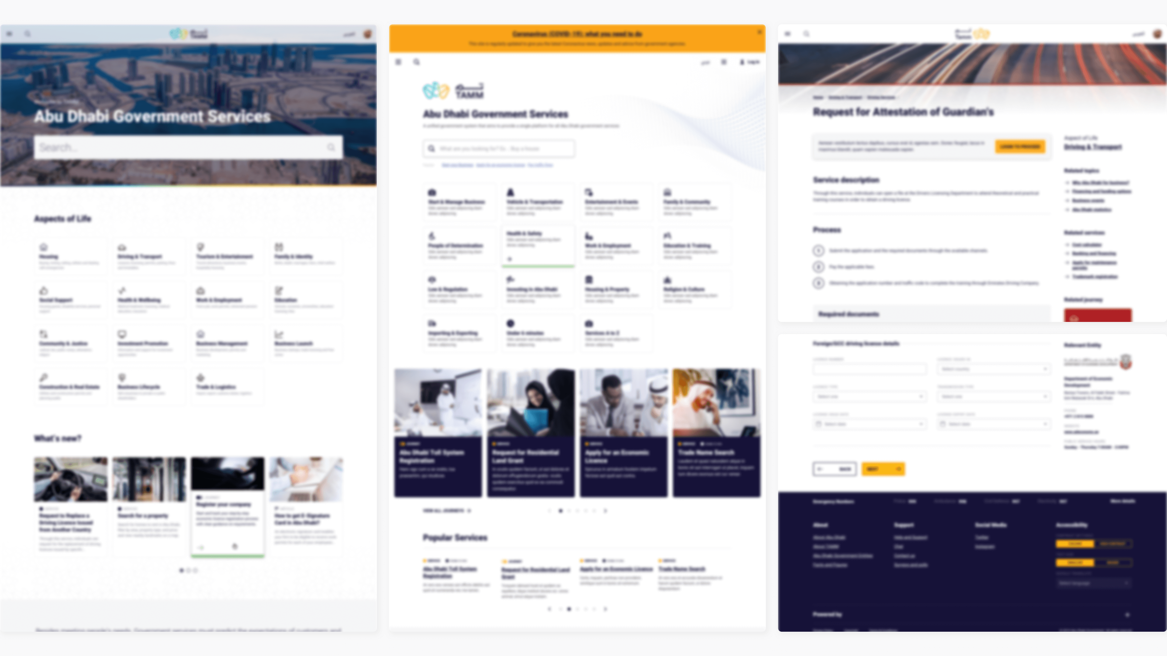
The purpose of the TAMM portal is to make it easier for citizens, residents, tourists, and investors to access a wide range of services from a single point of entry. The platform also removes the necessity for informational visits to actual government offices.
I was tasked with creating the online service portal when I joined the project. Despite the project's extreme complexity, I was fascinated by its uniqueness and clarity of purpose.
I engaged in the project over two distinct phases; the approach and team structure were different during each.
Goals
- Improve the portal's usability on different platforms by developing a uniform visual language.
- Improve user experience by eliminating confusion and introducing additional features.
- Establish a reliable design system that can be expanded in the near and distant
Team Structure
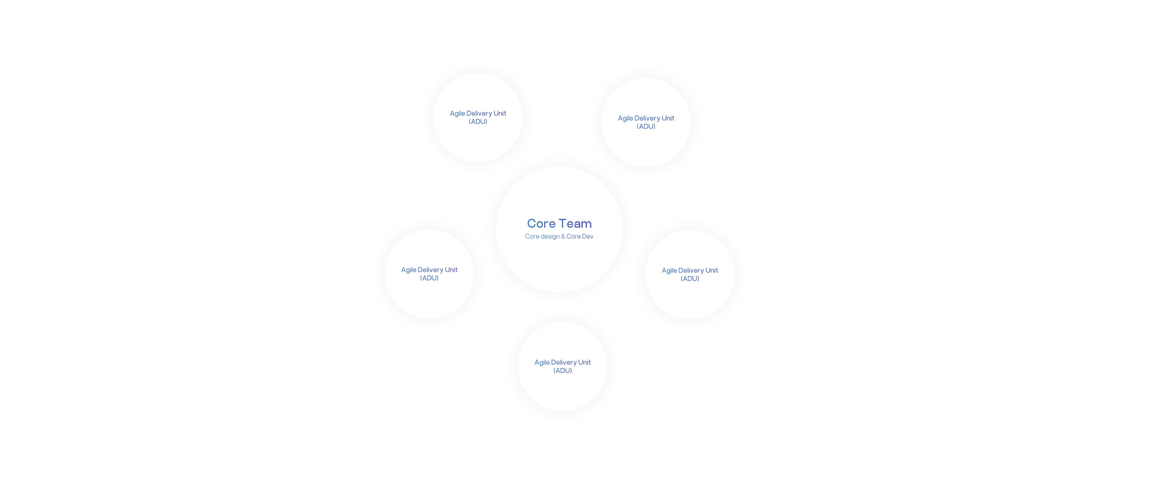
The project involved the largest design team I had ever worked with. There were several squads representing various workstreams depending on their nature. I was part of the Core team, which includes the core development and core design team. The core team was the centre point of all squads, contributing to the development and design decisions that impacted the project.
My day-to-day work revolves around the core dev team, agile delivery units (ADUs) and QA team.
We also had principal designers who handled daily operations in addition to these teams. Moreover, the principal designers from the core team and the client who make up the design authority team oversee the final product.
My Role
Developed, defined, and documented components and maintained the design system's sketch library. I was responsible for fulfilling the ADU's design requests, whether they were components, changes in templates or a flow, by validating them through the design team. Following DA approval, I get to work on the deliverables.
In addition to these responsibilities, assisted with design reviews, coached designers on guidelines, guided design best practices, and performed design QA for components and services. Also assisted with the onboarding of new core members.
Defining the Problem
It is required to digitise and consolidate over 2,500 government services and journeys fanned across 31 entities. A consistent user interface and experience across all services and journeys became essential because each has a unique business condition and requirement. We encountered numerous technical and practical issues at every turn.
Challenges
The inconsistent design guidelines applied throughout the portal led to a fragmented user experience and inconsistent content and functionality presentation. The primary difficulties we encountered during the term are outlined below.
- Inefficient processes - Certain designs required many approvals before moving forward, and constant changes to the brand and design guidelines acted as roadblocks that weakened schedule goals.
- Siloed teams - Inadequate team communication and a lack of ownership between teams.
- Agile growing pains - Still new to agile, the team's ability to quickly deliver and iterate was stifled by old waterfall habits
- Lack of skilled workers and slow hiring -The second phase's core design team had two principal designers and a senior designer. New member onboarding took more than six months.
- Unstable Sketch App - Late in 2019, the Sketch app team released many scary updates. Sketch app expanded the workspace. Since these updates, the sketch library files have unfixable bugs and the app crashes (In an effort to address these concerns, I emailed the sketch team, who were responsive and accommodating.)
Heuristic Evaluation and A/B testing
The heuristic evaluation looked at colours, design patterns, typography, journeys, live services, and design research conducted by the research team. Later, with the help of a new squad, we conducted A/B testing on the new interfaces and guidelines before implementing them to all live services, which revealed end-user pain points.
The results helped us support our heuristic evaluation findings and enlighten the leadership on UX best practices and accessibility. And allows us to implement and manage design thinking.
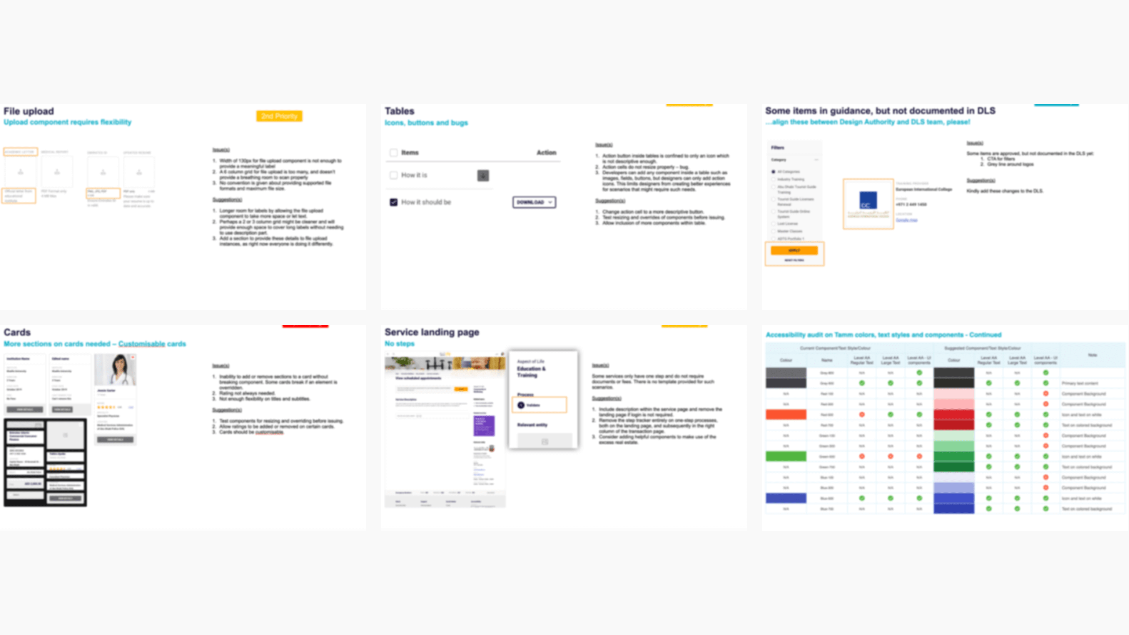
Component Prioritisation
Workshop was conducted to enable team members to coordinate around terminology while prioritising components to suit the efforts of both the business and design teams.
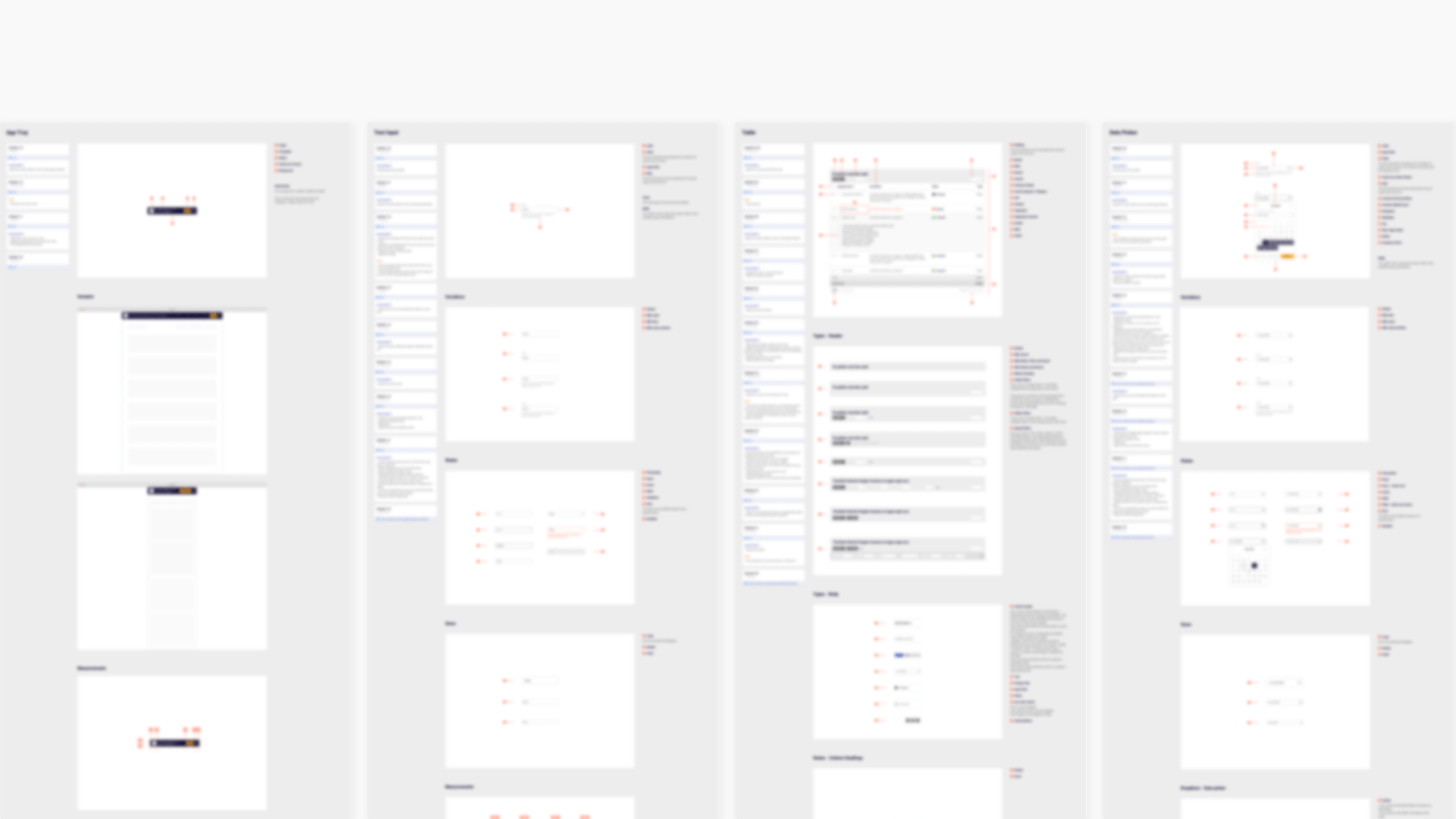
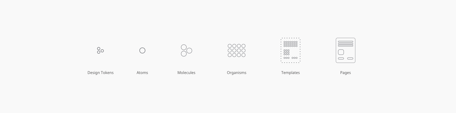
Pattern samples were offered to teams, and they were given a budget of checkmarks to apply to desirable components for consideration. We used Brad Frost's "Interface Inventory" approach to capture and classify essential areas and people to include.
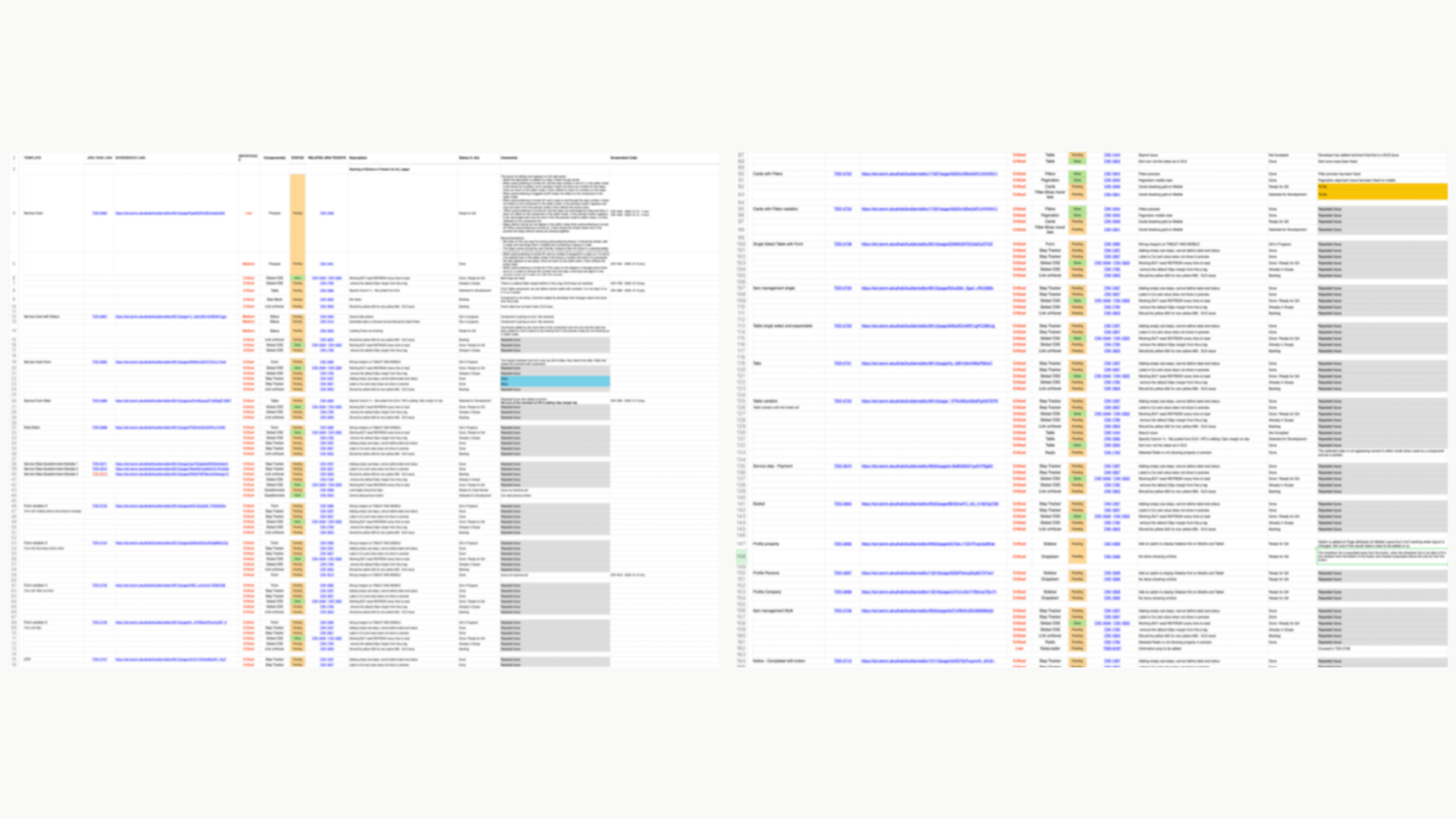
Created a list of all components and classified them according to the Brad Frost Atomic methodology. Also, compile a list of any improvements that might be required for each of them. There were around 130+ components and its instances
Style Inventory
Existing inventory and classification were chaotic. Despite the lack of a solid design system and coordination, every squad's design QA files were inconsistent. Thus, we conduct periodic workshops and an inventory audit of design systems. The core design team's one of the main goals in the second phase was to align all portal design aspects holistically.
The result from the Style Inventory audits
- 40+ Text Styles
- 5+ Fonts over
- Uneven hex colour codes and spacing guidelines are being used.
- Fractured nomenclature on design assets and component naming.
- Dozens of design files created by existing and/or past designers?
Design File Consolidation Exercise
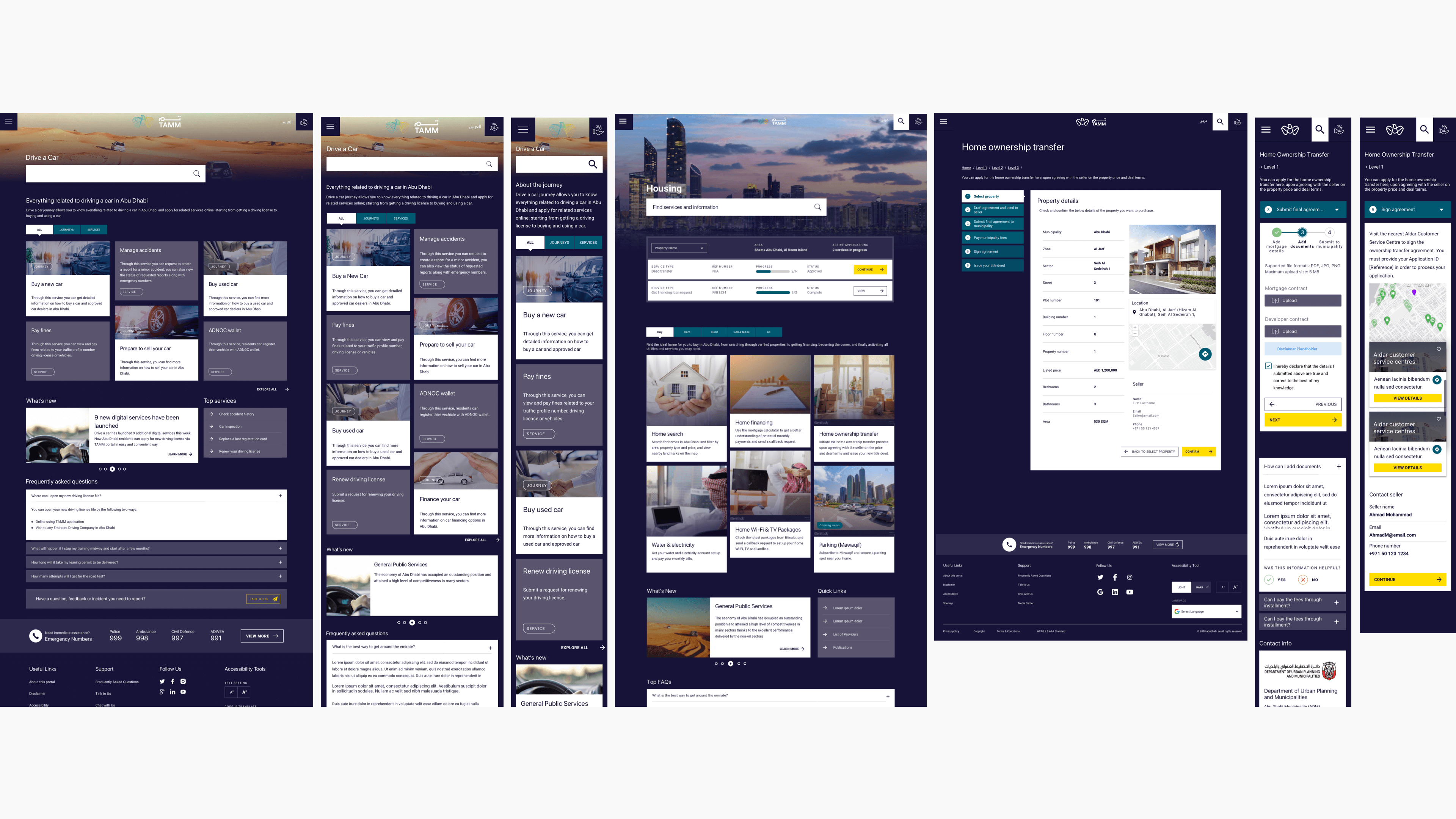
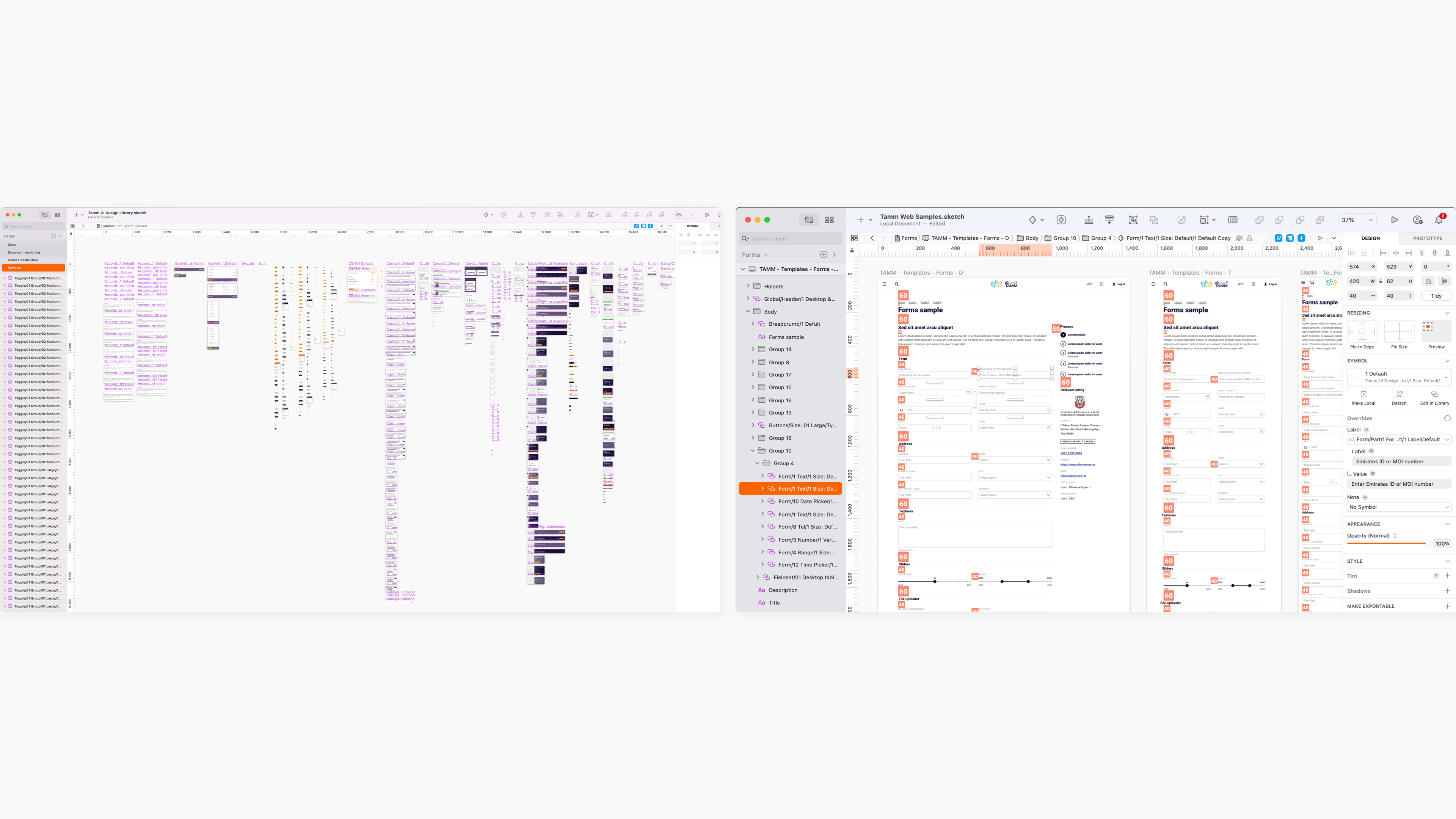
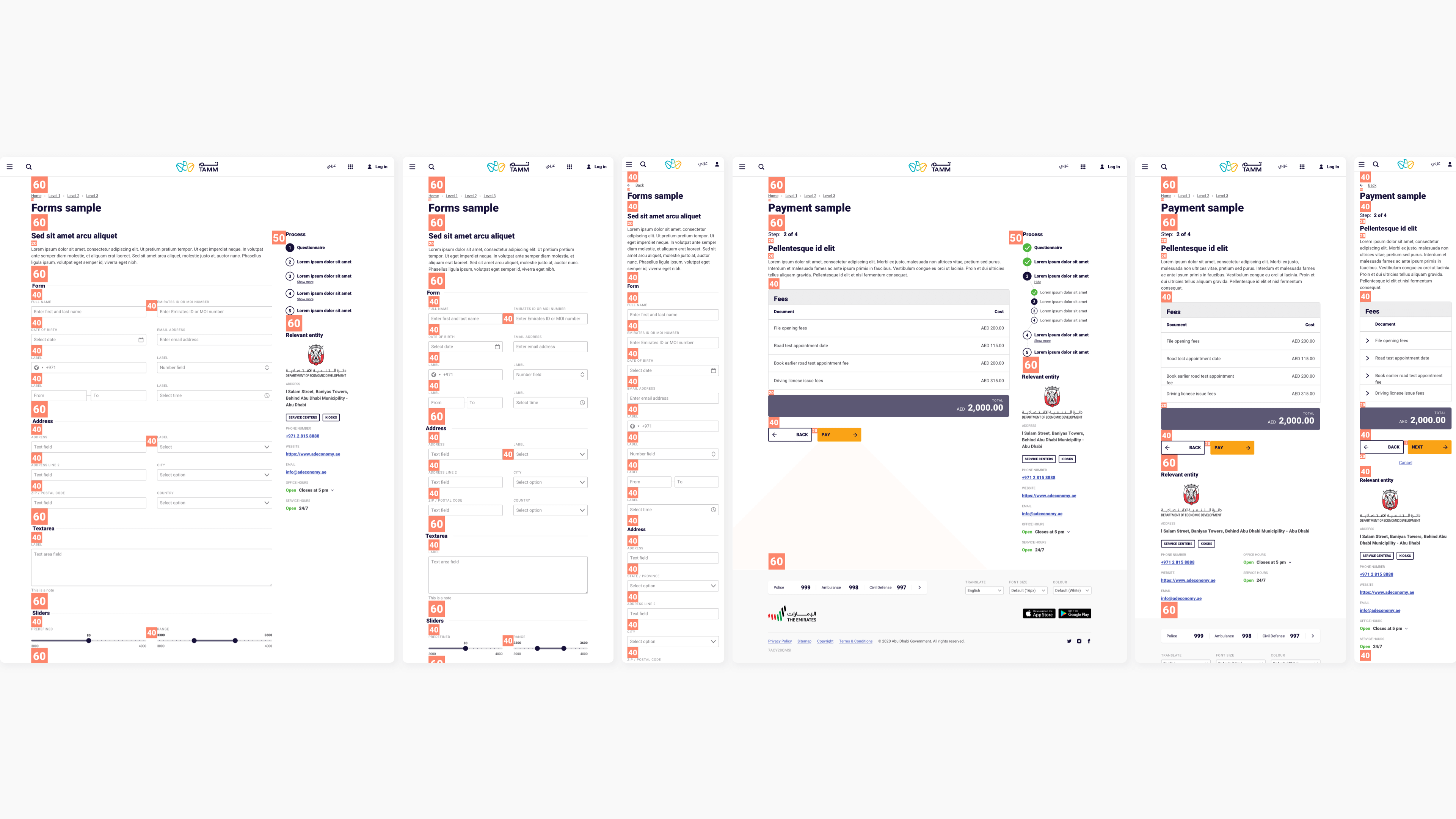
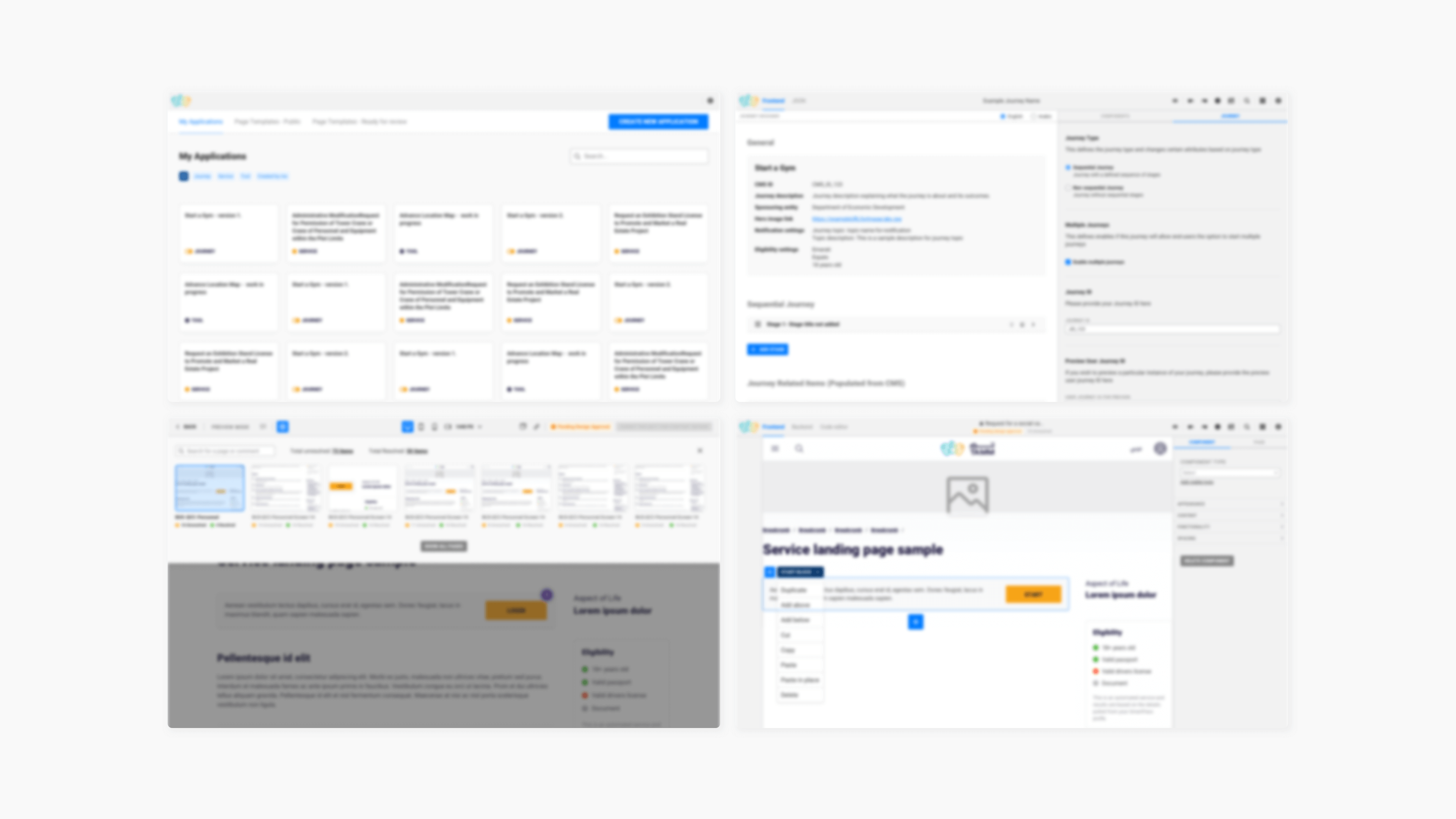
Combining all template files in one location was critical as part of the alignment exercises. We created a Web Sample with three breakpoints of all templates to help ADU designers collaborate and design effectively. It shows best practices with real examples of service flows, not instructions on how to recreate them. Also, I didn't forget to get feedback from the 35+ designers who used these assets, which helped me improve the files on every update.
Visual Exploration
I was able to create several explorations in an effort to establish a common visual direction by referring to previous design foundations, research, and brand guidelines. We wanted to ensure that the UI we created echoed TAMM's brand and mission statements while informing future design decisions.
Deliverables
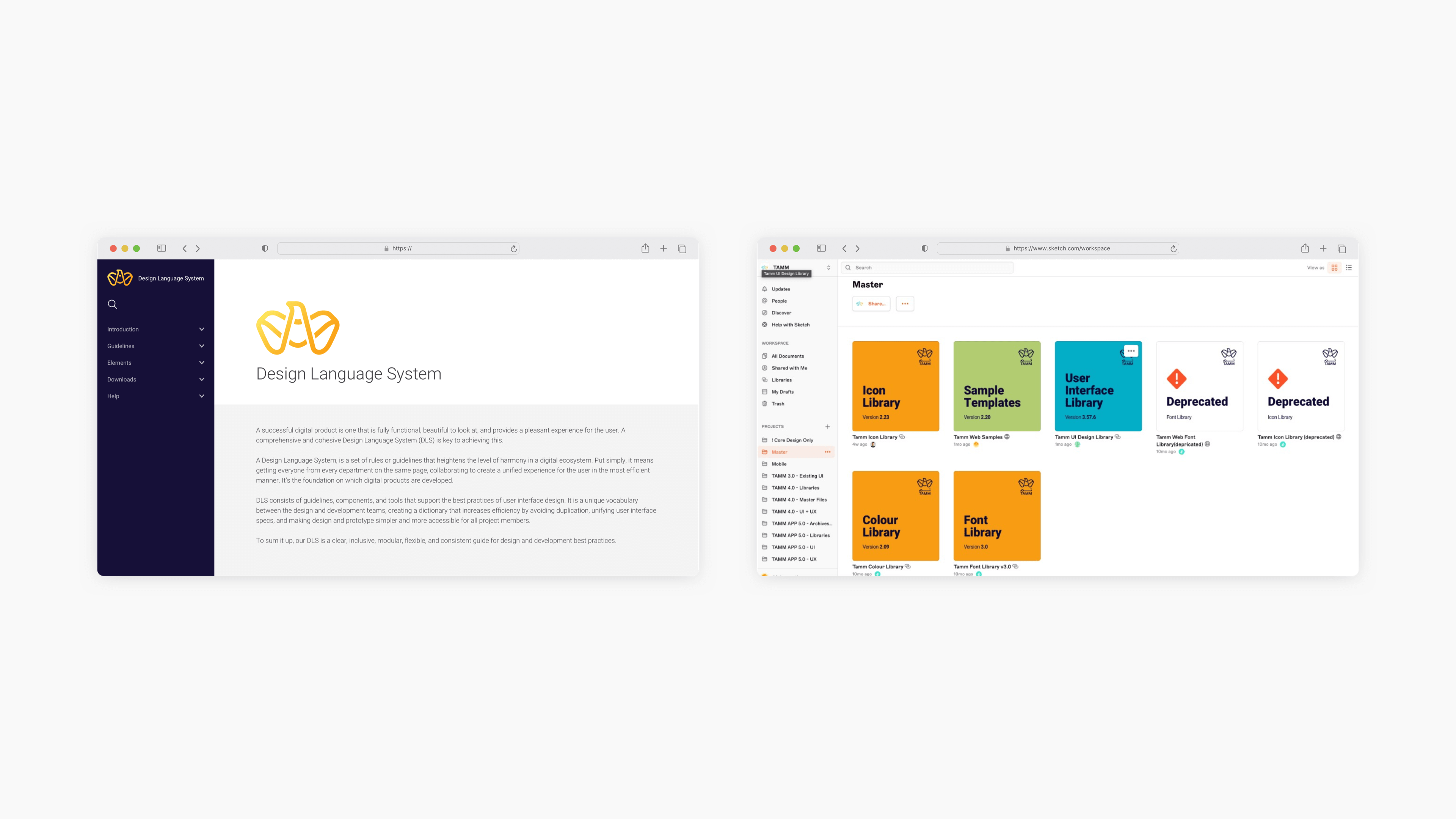
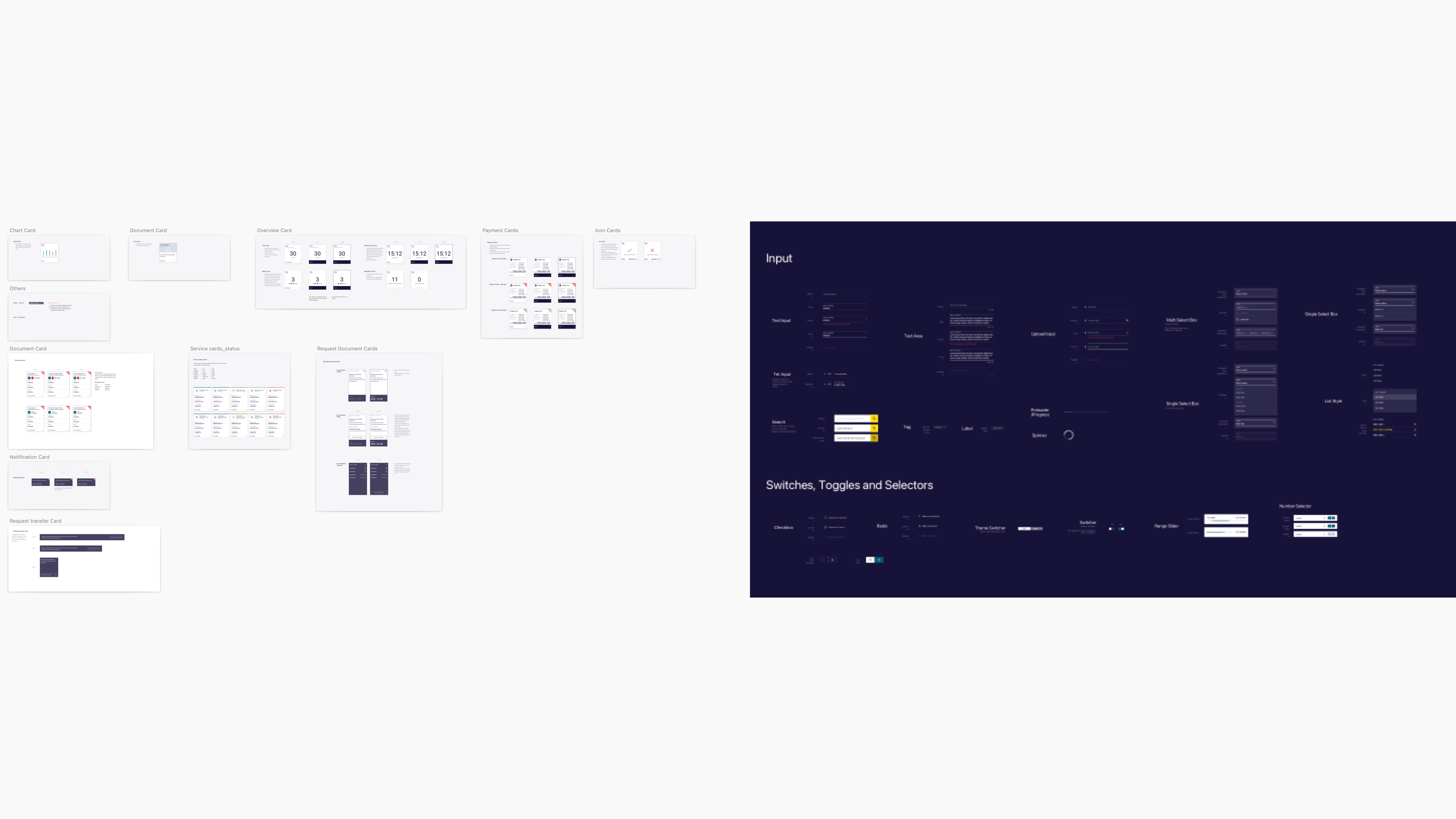
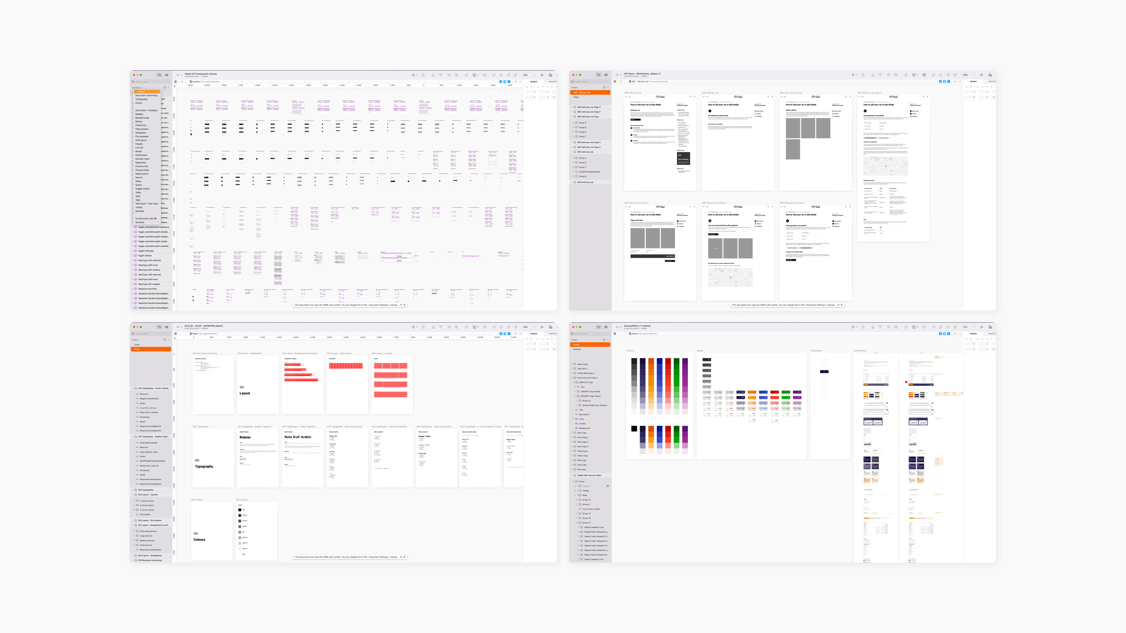
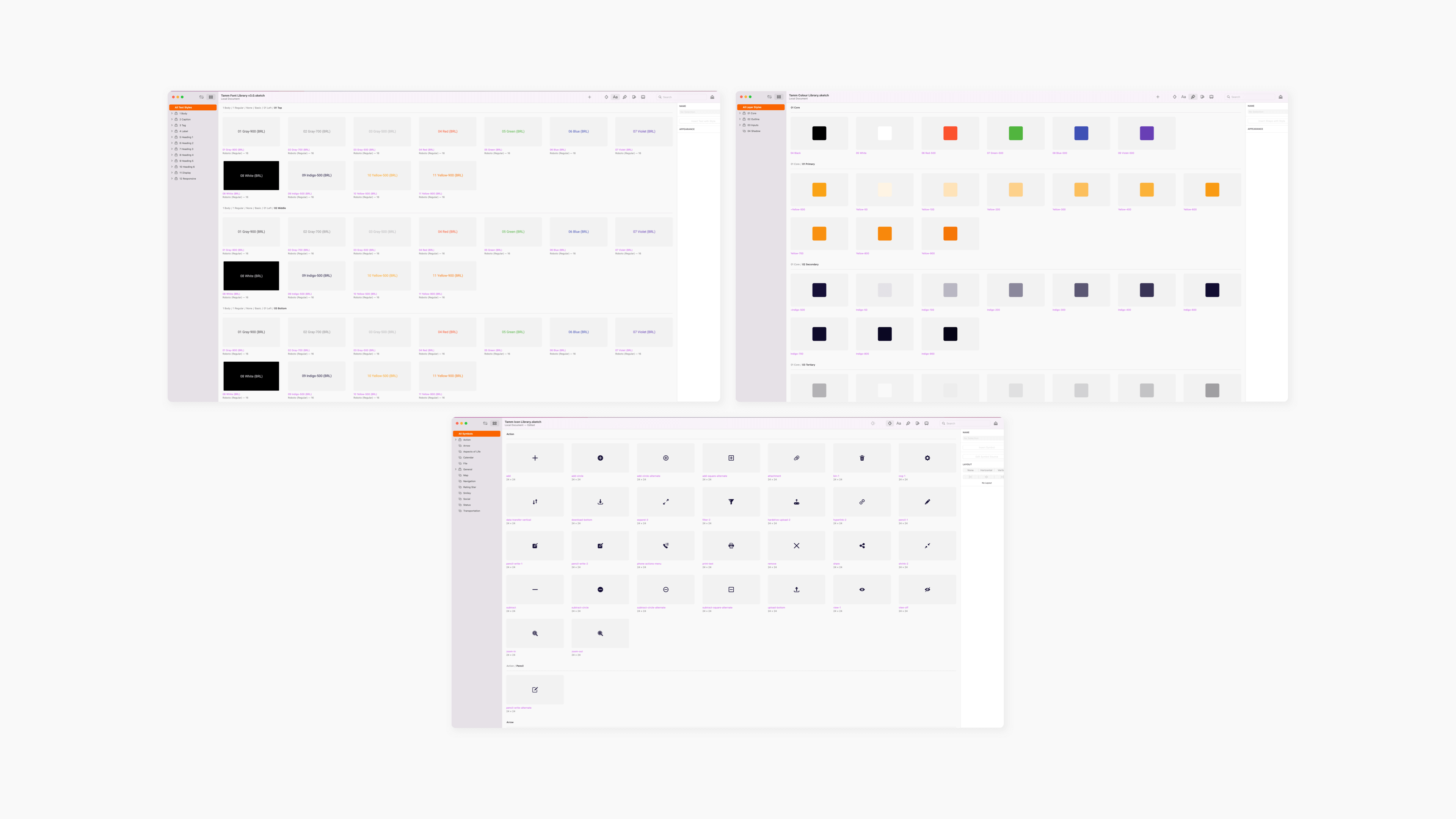
The team created several design resources, and I led the team in developing and upkeep the five essential sketch files that are the dedicated libraries.
- UI Design Library for components and their different versions.
- Colour Library
- Font Library
- Icon Library
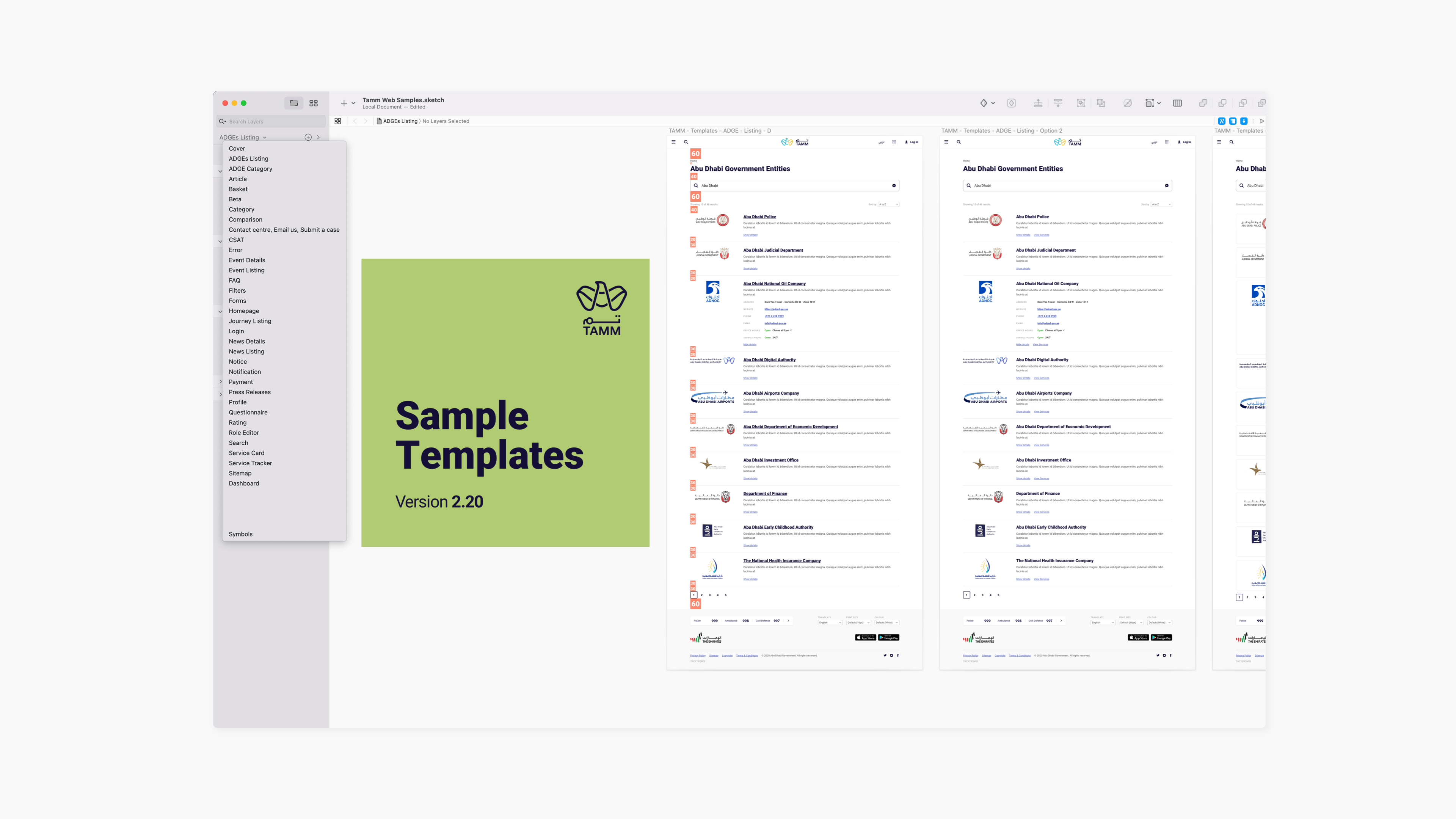
- The Web Sample sketch - Sketch file compilation of user flows that adhere to TAMM's design guidelines in a template form.
The sample file was shared and updated among designers, who use it to create their services and journeys. Several Zeplin projects hosted documentation of all components and web samples to help DLS developers understand the context, handle redlines, and implement a user interface. These Zeplin projects facilitated design discussions and provided designers and other team members with a shared documentation repository. Each sketch library resource follows Brad Frost's Atomic design methodology.
Foundation
A big part of how well a design system works is how well each component, page template, and prototype is built on the essential foundations. The project's foundational elements were drawn up in Sketch and sent to Zeplin for development after we chose a visual direction. I have separated the foundation into three sketch libraries for typography, colours, and icons to allow for future growth.
Foundation elements
- Colour Palette
- Iconography
- Grids and Spacing
- Typography
Sketch app made the sketch workspace available, making it easier to organise and share our work with ADU designers. The team used the Slack channel to share news and upgrades, and it helps educate designers on best practices and raises any library-related issues.
Several design system engagements on internal products followed my success in the design system strategy in the project's second phase.
Components
Once the project's foundations were set, the prioritisation backlog provided a delivery roadmap.
After approval, we'll delve into the UI and create backlog-based components. Over time, straightforward scenarios advanced into more complex ones. The first few months of the second phase were chaotic due to the ADU's many requests and the core design team's lack of resources.
It took me almost three months to clear out all component backlogs on Jira. The core design team eventually became twelve from just three members. And it was divided into two significant engagements, the portal and the mobile app. Due to the involvement of all designers in the project and their dependency, design system engagement was distinct and independent from other teams.
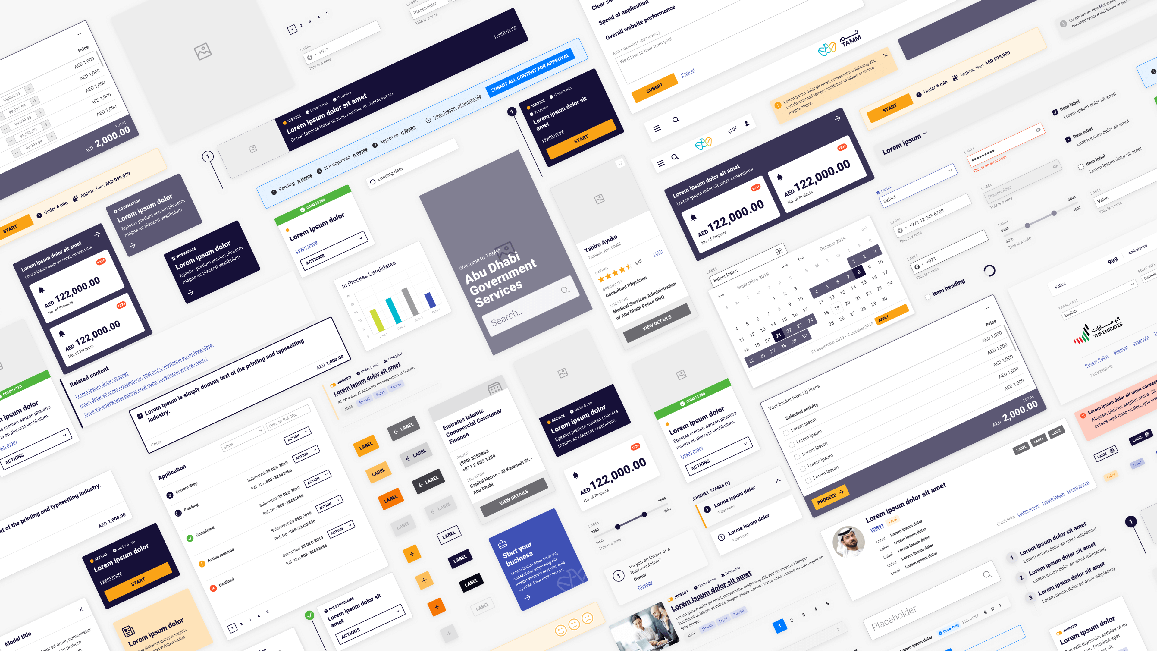
Web Samples(templates)
As mentioned earlier, having simple examples was necessary when working with multiple teams from different business units. Web Sample sketch file which included a full user flow in a template format, allowed designers to quickly create a high-fidelity interface for their services or journeys. This effectively reduced the time needed to build user flows and to obtain design authority approvals.
Other Involvements
I often helped with ADUs that needed extra hands, which allowed me to move between project workstreams where I helped develop a few services, contributed to creating an internal application called "workbench," and participated in workshops. This increased my empathy for designers, front-end developers, and BAs. When defending design decisions to other teams, I asserted authority and helped brainstorm solutions for outside-the-scope problems.
Symbol Duplication
Sketch app's new phase posed challenges. New features like the Sketch workspace and symbol functionality were causing havoc due to symbol and icon duplications. Due to these issues, we updated the library carefully, and I tested every sketch app update before letting other designers use the latest version.
The Result
The team was able to streamline and refactor the design process, which had a positive effect on the launch of live services. The key to this accomplishment was establishing a solid foundation for our design tokens, theming capabilities, and reusable components.
This project enabled me to assume an educator role within the team and pushed me to my limits. Additionally, working with a diverse team provided a significant learning opportunity.
TAMM DLS System was the largest design system I ever created, and it would be the foundation for all future design systems.